Wednesday, August 31, 2011

Floral Wet and Dry Embossing

I created this card for the Rogue Redhead Design August Rebel challenge using the sketch for the Mojo Monday challenge. The Rogue Redhead Design challenge is called surf and turf. We are to use both wet and dry embossing on our card. My wet (or heat) embossing was done on the focal flowers which are from the Rogue Redhead Design stamp sheet Floriculture. (The sentiment is from there also.) I used the neutral shadows technique from the Feb/Mar 2011 TJ newsletter. The dry embossing is on the green panel and on the bottom designer paper background. The DP is from My Mind's Eye. I followed the Mojo Monday square sketch fairly closely except I changed the rectangle panels to shaped panels.

Artistic Outpost--Fabulous New Releases

Today I'm so excited because Artistic Outpost has three new stamp releases.
Whimsical Melange
Whimsical Melange
Designed as background and embellishment images, this collection features whimsical frames sized perfectly for cards and ATCs as well as unique scrollwork, pennants in two sizes, and other whimsical bits.  Mix and match these stamps with our other collections to add a touch of something special and unique to all your projects.

Typography

Typography

From Mark Twain to Winnie the Pooh to Bob Marley, this collection of unique sayings and sentiments includes our favorite quotes from some of our favorite artists and characters. Designed to mix and match with our other stamp collections. Stamp sheet measures 8.5" x 5.5". Stamps are available as an unmounted sheet of red rubber or pre-trimmed and mounted on EZMount cling foam.

Favorite Book
A Favorite Book

Featuring vintage images of children reading, this collection provides focal images of something we wish our kids would do more of....slowing down, being quiet, and enjoying a good book. Images are designed with our other background collections in mind, such as Ephemeral Backgrounds and Whimsical Melange.
Here are some of the cards I created with the new stamps.

For this card I used an image and a sentiment from Favorite Book. Isn't this little fella darling? I added a background using My Mind's Eye paper. The A, B, and C were cut from the paper, adhered to the background, and highlighted with glossy accents. I just love the vintage look.

Whimsical Melange has images that are such fun to work with and that work so well with images from other stamp sets. For this card I stamped the ruler/pennant house frame on watercolor paper. I masked the edges and stamped the lighthouse from Beyond the Sea. I colored directly on the stamp with watercolor crayons, gave the stamp a mist, and stamped on the masked image. I used a Cheery Lynn lacy butterfly die cut which I adhered over the stamped butterfly. The entire image was cut out and framed using a torn frame (TJ technique). This was adhered to a piece of cardstock from the Tim Holtz paper stack and then adhered to a brown base card. The sentiment is from Typography.


I jumped for joy when I saw the stamps on the Typography set. One can never have enough sayings, and these are wonderful. On my card I used the image from Windows and Doors as the base for the sentiment. Using my stamp positioner, I positioned the birds on the railing and the saying in the space next to the lightpost. I die cut the image using a Spellbinders Fleur De Lis Rectangle die and colored along the edging with weathered wood distress stain. I layered the rectangle on a peachy panel and that on to a rust print card base.

For more inspiration, check out the fabulous artwork of the other design team members.

Bookmark Challenge


This is my final posting as Guest Designer on the Stampotique Designers Blog. I have really enjoyed my short time working with the great design team over there, and especially Kim Howard, who was so warm and welcoming to me. The current challenge  is to make a bookmark. Stampotique stamps must be used for this challenge.
My first bookmark uses the Corner Bookmark technique from the Apr/May 2011 newsletter. Jasmin (3007) is one of my favorite stamps. The sentiment is "Good things, good thoughts" (9012).
The second bookmark is a bit more traditional. It is made with two layers and is placed in a bookmark sleeve. The top layer is made using vellum. Both Moon Belly  (6039) and the sentiment "Each life needs its own quiet place." (3011) are stamped on the vellum. On the red under layer I stamped Doilie (9172) twice and embossed it with white embossing powder. The embossing shows through the vellum. By the way, my dd has already laid her claim on this one.

Monday, August 29, 2011

Travel in Style

This week Simon Says Stamp and Show Travel. I realized that I had many choices for travel images--trains, planes, and automobiles to name a few; so I decided to go with a hot air balloon for fun. As Tim Holtz says, "The Journey is the destination." I used this collage stamp from I Brake For Stamps. The background is blue cardstock that I sponged with winter frost Creative Inspirations Paints. Around the cardstock is an embossed frame highlighted with victorian velvet distress ink. The balloon was stamped a second time on design paper, cut out, and popped over the original stamped balloon. I added a ticket for the sentiment.
I am also adding this image to I Brake for Challenges (challenge shabby chic) since the image is from I Brake for Stamps.

Sunday, August 28, 2011

Halloween Fragments

This week has been quite hectic for me. I'm really behind in the regular challenges that I do and today is the deadline for several of them. Oh well, I'll do what I can.
This tag is for the Grungy Monday challenge: Tim Holtz Blog: Transparent Illusions. This blog post talks about different techniques using Tim's fragments. I decided to try the etching technique since I had never tried it before.
My tag was made by weaving orange and black strips together and then cutting the piece using Tim's tag die. The tag was adhered to a manila tag for sturdiness. The tag was dry embossed using one of Tim's Halloween texture fades. I used Tim's Halloween tissue tape around the tag.  I die cut the branch tree out of green cardstock and adhered it to the tag. My two fragments were "etched" with two images from Tim's Halloween stamp line. I used silver copper tape around the fragments.
The sentiment was stamped in Stazon on a metal tag cut with the small tag die which was then edged with tissue tape.
What a fun tag to make. I'm also going to share the tag on Hel's Ink on my fingers which has the challenge of birds.


Once Upon a Midnight...

I've been waiting to use these stamps from Rubber Bandit for a while now. Well today is the day. Kraft Journal challenged us to create something related to Movies, songs, or Books. Of course your recognize Edgar Allen Poe's "The Raven". I Brake for Challenges wants shabby chic and Hels at Ink on my Fingers challenged us to use birds on our art. My card is somewhat CAS, but I think my card meets all three challenges.

Friday, August 26, 2011

TIC TAC TOE


This week's Bloggers Challenge was really fun. Lisa gave us a tic tac toe board and we had to choose our winning row by using those items in that row on our artwork. I chose to go straight across the bottom row. I can't take credit for the layout, however. I followed the sketch for the Mojo Monday Sketch 205 challenge.
My image and sentiment are from the Artistic Outpost sheet Flapper Fashions. The circle frame around her is a die cut (Spellbinders Butterfly Circle). The three patterned designer papers are from Prima. Two of them were punched along the edges. The seam binding ribbon and bow were colored using victorian velvet distress ink and embellished with a button.
Both of these challenges were fun and they worked so well together. I can't wait to see how everyone else interprets this challenge.

Thursday, August 25, 2011

Don't Tickle the Dragon

My soon to be five year old grandson just started Kindergarten this week and each night before bed we read books together. He's getting to be a good reader.  Recently I was inspired to make some bookmarks for a challenge, and I thought that this dragon and the related sayings from the Chapel Road Artstamps, Quips, would make a cute set of  bookmarks for him. All of the stamping was done on vellum. The under layer of the bookmark was embossed in an embossing folder and highlighted with white ink. I love the way the embossing shows through the vellum. I had these bookmark covers in a drawer just waiting for the perfect time.

Monday, August 22, 2011

Marie Antoinette and a sketch challenge

The current Stampsmith challenge is a sketch. I decided to flip the sketch on its side. I used Marie Antoinette as my focal image. I stamped her on glossy paper. If she looks a little checkered, it is the result of scanning the glossy paper. In real life she looks like a photograph. Behind her is a vellum doily cut using a Cherry Lynn die. The background panel is paper which has glitter embossed flowers. The fleur de lis is a pearl embellishment from Prima.

Sunday, August 21, 2011

Heart Shirt in Love

This is another card I created as Guest Designer for Stampotique Stamps. It's also posted on the Stampotique Originals blog. Both Heart Shirt (6046) and Minky Girl (6125) wear their hearts on their shirts. Heart Shirt is giving Minky a flower (9105) but needs a little boost. The XOXO (6125) hugs and kisses gives him the height he needs. Don't they make an adorable couple.

Saturday, August 20, 2011

Bundle of Mischief.

This card is dedicated to my 11 month old granddaughter, Jayda. This image from Rare Images really reminds me of her and she definitely is a bundle of mischief.
This card meets several challenges. The challenge 113 at Gingersnap Creations is Babes and Tots. I used the sketch from Mojo Monday 204 for the layout. And, the challenge at Creative Belli is gingham. There's lots to talk about so I guess I'll start with the focal image. This little cutie is colored with watercolor pencils. I used  Spellbinders eyelet circles die to frame her. Then for fun I tried the Spirelli technique from the current TJ newsletter, only I varied it by working within the eyelets instead of around the outside edge..
The background is dry embossed to represent gingham. I used white pigment ink on the squares and embossed them with Ranger Antiquities Weathered White embossing powder. The ribbon is also gingham. Creative Belli encourages the use of older or forgotten embellishments. Both the embossing powder (which I had to have, but never used) and the ribbon are items from my past.
The yellow panel is stamped using a commemorative stamp from Stampland which is designed by the artist Scott Helms. (Another had to have item which has been used maybe once. It's a cool stamp though.)
The photo corner (lost for years and recently found) and the sentiment (See-D stamp) finish off the look.

Bon Voyage

Since all of the July challenges at Gingersnap Creations were Steampunk/Travel related, I thought I would end the month with something that went with all the travel themes -- a suitcase card. The challenge 112 was a color challenge to use leather, iron and brass. For leather I used both the blue faux leather paper for the straps and handle and distressed glassine paper for the actual case. The corners are iron with a bit of rust. The grommets are my brass. I've been wanting to play around with the vintage valise die from Tim Holtz. The stickers are from the salvage stickers collection.

Friday, August 19, 2011

Welcome to the Class Act/Chapel Road Blog Hop.

Welcome to the first Class Act/Chapel Road Blog Hop. If you've arrived here from the talented Gini's blog, you're in the right place. If not, you might want to start at the Class Act Insider  so as not to miss out on any of the great art work from the team.

You will see the newest releases from both of these lines on this hop. Our Theme will be BRIGHT COLORS, any bright combination.  Please leave a comment on every project of each design team member, and have your name entered into the draw to win a free rubber stamp from our Class Act line of stamps. If you leave a comment on each of the Design Team member's projects, that will give you 7 chances to win. A random winner will be chosen. Below is the order to hop around! The blog hop will end on Thursday August 25, 2011 at 7:00 p.m. and the winner announced the following day.


Class Act Insider
Suzanne
Sheila
Holly
Gini
Barbara -You're HERE
Chelsea

With a theme of bright colors, I immediately knew which stamps I wanted to feature on my card. I had fallen in love with the new release -- Harlequin. To begin my card, I stamped the Harlequin on white cardstock. I just love the detailed lines of the character. I used Creative Inspirations Paints to paint the image because I thought that the shimmer would add to the bright comic look of the character. The sentiment panel behind the harlequin was first dry embossed using a brass stencil and a stylus. Then I used the brass stencil to stencil white paint over the diamonds. I stamped the sentiment on that panel. On the orange panel, I stamped the  mask and some of the words from the set randomly all over. All of the layers were adhered to an ivory card base.

I hope you'll leave a comment here for a chance to win and then head over to Chelsea's blog for the last stop on the hop. Thanks for stopping by.

Home Sweet Home

Bloggers Challenge this week is a sketch provided by our group mom, Lisa. I love sketch challenges because it is always so interesting to see how each person interprets the sketch. When I started I had a totally different idea of what I was going to do. Then I found the row of houses (Club Scrap) and I thought it would be fun to follow the house theme, using the houses instead of a ribbon. Even my backgrounds are house related -- brick and marble.
This card also meets the challenge at The Kraft Journal using Kraft Outlet paper as the base card.
I'm looking forward to seeing everyone's cards this week.  Happy Friday!

Thursday, August 18, 2011

Elegant Grunge.

Who says that grunge can't be elegant. This card has so many elements. Distress stickles and distress ink for the Grungy Monday challenge; a bit of bling for the Simon Says Stamp and Show challenge; elegance for the Critter Sketch wedding challenge; and a non-stamped sentiment for the Tuesday Throwdown challenge; and the Ink On My Finger Sunday Challenge which is white. The card base is a piece of silver luster from Paper Temptress. In real life it is gorgeous; scanned it gets a little shadowy. The white lacy border and the stems are from a Cherry Lynn die. Rock candy stickles give the frame a beautiful, subtle sparkle. The stems were treated with bundled sage distress stickles. The flowers are made with three layers of white prima flowers. The top and bottom layer was colored with spun sugar distress ink. The middle layer was colored with victorian velvet distress ink. Each of the petals was tipped using spun sugar distress stickles. All of the distress inks and stickles are from the Tim Holtz/Ranger line of products. The ribbon carries the sentiment "Best Wishes". The bling in the flower centers and bow center are from Prima. Love all the bling and sparkle of this card.

Wednesday, August 17, 2011

Color Layered Koi

The Try That Technique challenge this week was Color Layering from the Jun/Jul 2007 newsletter. The koi was stamped using the technique. Then I masked the image and stamped the leaves. I sprayed the panel with Glimmer Mist which did cause some of the marker to wick into the watercolor paper, but that's the nature of water color. I also used the wisped corners technique to soften the stark white of the panel. The background paper is from My Mind's Eye and Club Scrap. All of the stamps are Stamp Zia.

Sunday, August 14, 2011

You Can't Hurry Love


This has certainly been a marathon blogging day for me. I hope you enjoy all of the entries.
The current challenge on the Stampsmith Challenge blog is teal and yellow, two of my favorite colors. To create my card, I used the image of the Supremes from Fab Faces. The background panel was first colored with teal and yellow Pan Pastels and then embossed with the distressed frame texture fade from Tim Holtz. I highlighted the frame with teal ink. The image was die cut using the distressed edge rectangle from Spellbinders and then edged with the teal ink. I thought that their song "You can't hurry love" made a great sentiment.

Ferris Wheel Friends

When I think of a carnival, the first thing I think of is the ferris wheel. It is such an impressive ride to see. Both Critter Sketch and Kraft Journal had carnival as their challenge theme. To create my card, I used the sketch from the Mojo Monday challenge. I love this vintage ferris wheel stamp from Club Scrap. Two friends are having so much fun on the ride. The sentiment seemed perfect for the scene. The background paper is from Webster's Pages. I loved the carnival stripes in the muted tones which go so well with the vintage image. The Spellbinders die cuts and center paper are from Club Scrap and the card base is from Kraft Outlet. The three metal buttons are from my stash.

Steampunk Collage

The Gingersnap Challenge 111 is Planes and Trains. Steampunk is the theme of the month of challenges, which is a favorite style of mine because it is so crazy fun. For my card I combined stamped images from the Artistic Outpost Steampunk stamp sheet with an outline sticker bi-plane and the gears texture fade from Tim Holtz. Add a little distress ink, some gold foil paper for the plane and a couple of resisters and a steampunk collage is formed.

Embossed Acetate

This week the challenge at Grungy Monday is Tim Holtz 12 Tags of Christmas 2010, Day 10 and Simon Says Stamp and Show a Tim Holtz Technique. These two challenges definitely work hand in hand.
My card uses background paper from Graphics45 which was embossed using  Tim Holtz' Halloween  words texture fade. I used white ink to highlight the letters. The rickety house is cut from Grungeboard and colored with wild honey distress stain. My acetate overlay was embossed using Tim's spiderweb texture fade. If you look closely, you will see a big black spider at the window of the house. It is from Artistic Outposts new Halloween Treats stamp sheet. Up in the corner is a little witch (Kitchen Sink Stamps) flying over a punched yellow moon. I had no idea what I was going to do for these challenges until I remembered the spider web texture fade. Then everything just worked. Funny how that happens!

CHAPTER 6 Challenge: Painting the Roses Red! Week 2

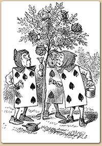
'A large rose-tree stood near the entrance of the garden: the roses growing on it were white, but there were three gardeners at it, busily painting them red. Alice thought this a very curious thing, and she went nearer to watch them, and just as she came up to them she heard one of them say, `Look out now, Five! Don't go splashing paint over me like that!'

-- Chapter 8, Alice's Adventures in Wonderland
 
The cards were painting the white roses red to avoid angering the Queen of Hearts, so your challenge is to use PAINT on your creation! Of course you can paint it RED like the design team will be doing, but you can also use other colors. You need to tell us what item was painted, what technique you used, and give us a mention and a link of course!
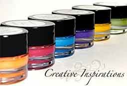
We are sponsored this month by Creative Inspirations [Store - Blog], makers of wonderful shimmering paint which comes in almost 60 colors, including clear iridescent Fairy Dust. They also carry hot fix Jeweled Inspirations and Metallic Inspirations; I am particularly intrigued by the latter as they look like brilliant nail heads. The Altered Alice design team will be using Garnet paint, a bright sparkling red, and I hope the Creative Inspirations design team might decide to play along! The winner of this month's challenge will receive five colors of their choice.

Be sure to enter by 11:59 p.m. EDT (Eastern Daylight Time, UTC -4:00) on Friday, August 26. The winner and honorable mentions will be announced the last Sunday of the month on August 28.


My first inspiration project is a shadowbox. My images actually come from a set of digital coloring book pages at hellokids. It's an image from the Disney movie. I had bookmarked the site for my grandson, since there were a lot of Alice in Wonderland pages. However, this page was so perfect for this challenge. I printed the page on sticky back canvas. I used Creative Inspirations to paint the image (except the sky which I did with Pan Pastels. Canvas is not a requirement to use these paints, it was just something I wanted to try. The roses are white ribbon roses which I painted with the red (garnet) paint. The roses along the side are from Tim Holtz's rose ribbon. These were dyed with fired brick distress stain. Alice was cut from another of the Disney pages. She was colored with Copics. The frame is a shadowbox with the glass removed (violently). I used white and black gesso to distress the wood. the sentiment was computer generated and adhered to the pennant die cut.
My second project came about when I went to purchase the shadowbox for the first project. I saw these chipboard letters and thought that the R would be fun to alter for this challenge. R is for Red and Roses. I painted it with white gesso and edged it with fired brick distress stain. The queen, the painting cards, and the "Off with her head" were stamped and colored. All of the red is Creative Inspirations garnet paint. "Painting the Roses Red" was computer generated. I hope you will join the Challenge. Do visit the blog. I think you'll be inspired.
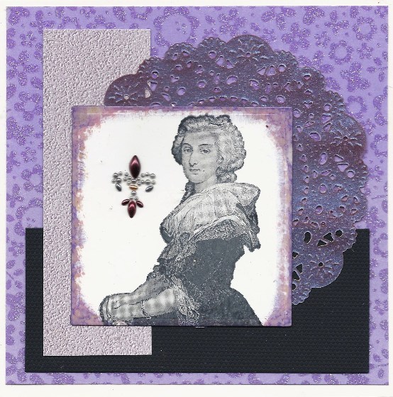
Friday, August 12, 2011

Back to School

I guess this is an appropriate posting to be a little late with. My grandson starts kindergarted (in the big school) in a week, so I've been spending a little more special time with him over the last several days. I haven't spent as much time in the studio as I wanted or needed. Two highlights were Pinocchio (the play) and the jellies at the aquarium. In Joshua's words, "It was amazing!"
But now on to my card. Both Bloggers Challenge and I Brake for Challenges had the theme of Back to School. My image is from Artistic Outpost, Think and Wonder. I stamped the image with Versafine Smokey Gray and highlighted the letters with red marker. I used Spellbinders label eighteen to cut the image. The background was made using alcohol inks to look like a blue plaid school uniform and was then cut using the Spellbinders lattice rectangle die. A red ribbon was laced through the lattice edge and tied in a bow. I attached a muse token saying "Knowledge" to the top corner and a pen nib finishes off the letter Z.
I can't wait to see how everyone has interpreted this challenge.

Thursday, August 11, 2011

A Card Fit for a Macho Man

This month the challenge at Artistic Stamper is Men/All Things Male Themed. I think that the combination of the masculine colors from Rangers Adirondack inks and the fantastic image, sentiment, and background stamps from Chapel Road Artstamps (Class Act Inc) make for a great masculine card.
I tiled two textures stamps from the Chapel Road Artstamps new releases for August: Old Bricks and Fossil as background. The main image is from the set, Two by DaVinci. The sentiment is from Inchy Words. I layered the image on a Spellbinders die cut label. I think this card has a very masculine flavor.

Wednesday, August 10, 2011

Altered Book Pages Stampotique Style

I'm really enjoying my time as guest designer at Stampotique Designs so much. My artwork this week is for the new challenge SDC 36 --Alter a page in a book/journal. This challenge was a lot of fun for me. I've never actually altered a page in a book before, but it's been on my art list of things to do. I actually have several books which I collected just so I could alter them.
I actually took one of those books for this project. I started by re-covering the book with blue book paper. I removed the cover so I could get a good cover and then re-assembled the book. I used one of my favorite cards made using Stampotique stamps as the front cover image.
To create the first altered page, I started by fold two pages -- the first from top corner down along the center of the book and the second from bottom corner to the center. Each section was colored using Tim Holtz distress stains -- dusty concord, walnut stain, and weathered wood. The sun  was cut using a Spellbinders die. The center is a button I stamped on grungepaper and colored yellow with distress ink. On the bottom of the page, Bob in Time Out is sitting on the stamped word Laugh and layered against a Spellbinders Label 18. I love that the distress stains allow the words of the page to be seen. The metal embellishments along the fold are metallic inspirations from Creative Inspirations.


The next page features Daffodil. I cut a nook in the book 
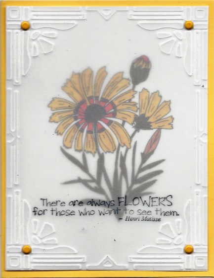
to place Daffodil in. Again I used distress stains to color the backgrounds -- faded jueans, forest green, and peeled paint. Daffodil is colored with Copics. In the upper left corner I stamped the Love You Heart. In the upper right corner I adhered Metallic Inspirations (from Creative Inspirations). Along the right side I added the sentiment which I stamped on a separate paper and cut into blocks. For the bottom I cut a wide On-the-Fence edge (Tim Holtz die) and stamped Abby's Hearts along the width. I paper pieced the heart flowers.

This is what you get when you combine an old book, some cool Stampotique stamps, and Tim Holtz products. Hope you enjoy seeing my book as much as I enjoyed making it.

Tuesday, August 9, 2011

Birthday Flowers

Today is my dd's birthday. Happy Birthday Kerry!
This card uses one of my favorite techniques with Creative Inspirations paints. It's reverse acetate painting.  First, I start with a piece of acetate to fit the front of my card. For this card I cut a piece from an acetate box I had received some craft accessory in. Then I stamp my image using Stazon on the front side of the acetate and then paint the image on the reverse of the acetate. I used citrus, evergreen, sunshine, fuschia, plum and pink highlights for my image. The one thing to remember is that what you paint first is at the front of the finished image. For this card I started by painting the shading of the flowers. Then I painted the other areas. One other tip is that I find that I get a better look if I dab on the paint rather than stroke. 
For this card I used the lace die and the fuschia stamp from Heartfelt Creations.  . I thought the lacy die cut was perfect for the flowers. I adhered the lace die cut to a lighter green panel and attached the painted acetate to the panel with four gold brads. All layers were adhered to a darker green card base. The Happy Birthday sentiment is an Outlines Sticker.
This month the Inspiration Emporium challenge is "Got Paint?" I think this card qualifies since paint is the
medium of choice here. Also Tuesday Throwdown wants to see a birthday card.

Sunday, August 7, 2011

Summer Flowers

My card features a Daisy digi from Glitterbabe. My garden is full of daisies, so I thought that my card truly represented summertime at its peak and that's the challenge at Tuesday Throwdown -- summertime. I used the Vellum Sentiments technique from the current Technique Junkies newsletter. My daisy was colored with Copics. The vellum overlay was dry embossed using a Cuttlebug embossing folder frame. The sentiment is stamped on the vellum with Stazon. Four yellow brads adhere the vellum to the image panel. These panels were then adhered to a yellow cardstock base.

Journey Tag

This week the challenge at Grungy Monday is 12 Tags of Christmas 2009, Day 8 and Simon Says Stamp and Show a tag. My antiqued vellum is a road map. Of course, I had to use the antique car which is heat embossed on grunge paper. Attached to the road map is a New York license plate and hanging from the ribbon is a philosophy tag which says Journey. Everything I used on my tag (except the ribbon) is from the Tim Holtz line of goodies. 

Friday, August 5, 2011

Color Challenge Inchies


Bloggers Challenge this week is a color challenge. At first I thought that the colors would be hard to use. I don't usually think of green, purple, and brown as going together. However, once I pulled out the right stamps, the right designer paper and some Club Scrap cardstock, everything fell into place.
I started with some new stamps from Chapel Road Artstamps -- Inchy Designs and Inchy Words and stamped them on various pieces of green design paper of various shades. I used a one inch square punch to cut them out. A little vintage photo distress ink along the edges finished them. I layered the inchies on a piece of kraft cardstock which I had embossed with the dots and then highlighted with vintage photo distress ink. I then adhered the brown layer to a piece of green Designer Paper with purple flowers (also used for some of the inchies) and then layered everything to a purple base card. The inchy card is a variation of the By the Inch technique from the Oct/Nov 2010 TJ newsletter.
I look forward to seeing what everyone else has created using these colors. Happy Friday.